Inspector Panel
The Inspector Panel is your primary control center for viewing and modifying object properties. It appears on the right side of the window and is context-aware — the sections it displays change based on what you have selected on the canvas.
Toggle the Inspector using the Show/Hide Inspector button in the toolbar.
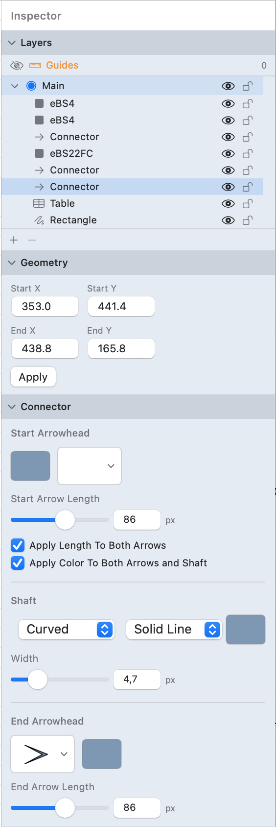
Layers
The Layers section is always visible regardless of selection. It shows the layer hierarchy for the current document page.
- Layer Visibility: Click the eye icon to show or hide a layer. Hidden layers do not appear on the canvas or in exports (unless explicitly included).
- Lock: Click the lock icon to prevent editing objects on that layer. Locked layers cannot be selected or modified.
- Rename: Double-click a layer name to edit it.
- Active Layer: The highlighted layer is where new objects are created. Click a layer to make it active.
- Reorder: Drag layers up or down to change their stacking order. Objects on higher layers appear in front of objects on lower layers.
- Add / Remove: Use the + and − buttons at the bottom of the layer list to create or delete layers.
!TIP Use multiple layers to separate background elements (grids, guides) from foreground content (shapes, connectors). You can then lock the background layer to prevent accidental edits.
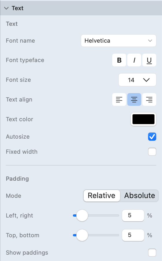
Text
Appears when a symbol, shape, or table is selected. Controls the text content displayed inside the object.
Font
- Font Family: Choose from a dropdown of all installed system fonts. Type to search by name.
- Font Size: Enter a size in the text field or choose from the preset dropdown (e.g., 9, 10, 11, 12, 14, 18, 24, 36, 48, 72).
- Bold (B): Toggle bold weight.
- Italic (I): Toggle italic style.
- Underline (U): Toggle underline decoration.
Color and Alignment
- Text Color: Click the color well to open the color picker. Adjust opacity separately.
- Alignment: Choose Left, Center, or Right horizontal alignment using the segmented buttons.
Sizing
- Autosize: When enabled, the shape automatically resizes to fit its text content.
- Fixed Width: When enabled, the shape maintains a fixed width and text wraps within it.
Padding
Controls the spacing between the text and the shape boundary.
- Mode: Switch between Relative (percentage of shape size) and Absolute (fixed pixel values).
- Left / Right: Horizontal padding sliders with numeric fields.
- Top / Bottom: Vertical padding sliders with numeric fields.
- Show Paddings: Toggle visualization of padding guides on the canvas for the selected shape.
Geometry
Appears when symbols, shapes, tables, groups, or images are selected. Provides precise control over position and dimensions.
- X: Horizontal position of the object's origin on the canvas (in points).
- Y: Vertical position of the object's origin on the canvas (in points).
- W (Width): The horizontal dimension of the object.
- H (Height): The vertical dimension of the object.
- Rotation: Angle in degrees. Enter a value or use the field to rotate the object around its center.
- Apply: Click to confirm changes made in the text fields.
!TIP You can also move objects by dragging, resize using handles, and rotate by dragging the rotation handle above the selection.
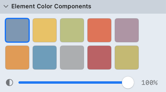
Element Colors
Appears when notation symbols (from the shape library) are selected. Does not appear for vector paths or images.
- Color Scheme Grid: A grid of color swatches showing all available color schemes for the selected notation. Click a swatch to instantly recolor the symbol.
- Opacity: A slider (0% to 100%) controlling the overall transparency of the symbol.
Color schemes allow you to quickly change the visual appearance of notation symbols without manually adjusting individual fill and stroke colors. Each notation pack defines its own set of color schemes.
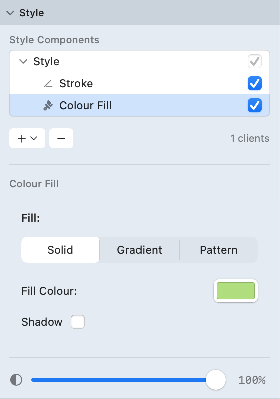
Style
Appears when vector path objects (rectangles, ellipses, freehand drawings, etc.) are selected. Provides full control over the visual rendering pipeline.
The Style section uses a component outline tree that shows the rendering stack for the selected object. Each renderer can be individually enabled or disabled with a checkbox.
Stroke
Controls the outline of the shape.
- Color: Click the color well to set the stroke color.
- Width: Adjust the line thickness. Slider with preset tick marks at 1, 2, 4, 8, 12, 16, and 20 points.
- Dash Pattern: Choose a line style from the dropdown:
- Solid, Dotted, Dashed, Dash-Dot, Dash-Dot-Dot, Long Dash, Short Dash
- Cap Style: How line endpoints are drawn — Butt, Round, or Square.
- Join Style: How corners are drawn — Miter (sharp), Round, or Bevel (flat).
- Shadow: Toggle a drop shadow on the stroke.
Fill
Controls the interior of the shape. Choose a fill type from the tabs:
- Solid: A single flat color. Click the color well to choose.
- Linear Gradient: A smooth transition between two or more colors along a straight line.
- Drag color stops on the gradient bar to adjust positions.
- Angle: Set the gradient direction using the dial, numeric field, or stepper.
- Radial Gradient: A circular transition from a center point outward.
- Same color stop controls as linear gradient.
- Pattern: Fill with a repeating image or texture.
- Use Paste to paste an image from the clipboard, or Load to choose a file.
Shadow (for Fill)
When shadow is enabled on the fill:
- Angle: Direction of the shadow (dial control).
- Distance: How far the shadow is offset from the object (slider).
- Blur: Softness of the shadow edges (slider).
- Shadow Color: Click the color well to set shadow color and opacity.
Additional Renderers
The rendering tree supports additional renderer types that can be added via the + button:
- Arrowed Stroke: A stroke with arrowhead endpoints.
- Rough Stroke: A hand-drawn sketch-style stroke.
- Zig-Zag Stroke: A zigzag-patterned stroke.
- Zig-Zag Fill: A zigzag-patterned fill.
- Hatch Fill: A diagonal line pattern fill.
- Path Decorator: Repeats a motif image along the path.
- Text Adornment: Adds text rendered along or inside the shape.
- Image Adornment: Adds an image inside the shape.
- Renderer Groups: Group multiple renderers together for combined effects, including Blend & Mask and Core Image filter groups.
Opacity
- Opacity: A slider (0% to 100%) controlling the overall transparency of the entire object, applied after all renderers.
Contour
Appears for notation symbols and images. Controls the outline drawn around the shape, independent of the shape's fill.
- Draw Only Contour: When enabled, only the outline is drawn — the shape's interior fill and color scheme are hidden.
- Contour Color: Click the color well to set the outline color.
- Contour Type: Choose a line style — Solid, Dotted, Dashed, Dash-Dot, Dash-Dot-Dot, Long Dash, Short Dash.
- Contour Width: Adjust thickness from 0.5 to 10 points (slider + numeric field).
- Contour Opacity: Adjust transparency from 0% to 100% (slider + numeric field).
- Shadow: Toggle a drop shadow effect on the contour.
!TIP Use "Draw Only Contour" to create wireframe-style diagrams where shapes show only their outlines without fills.
Connector Geometry
Appears when one or more connectors are selected. Shows precise endpoint coordinates.
- Start X / Start Y: The position of the connector's starting point.
- End X / End Y: The position of the connector's ending point.
- Apply: Click to confirm coordinate changes.
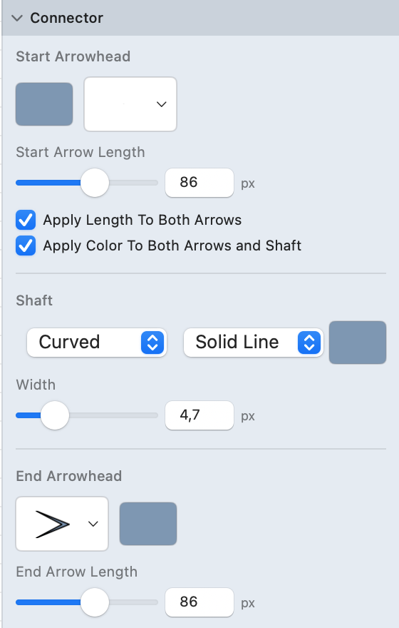
Connector Style
Appears when regular connectors are selected (not thick/body connectors). Provides full control over connector appearance.
Arrowheads
- Start Arrowhead: Click to open the arrowhead picker for the start of the connector.
- End Arrowhead: Click to open the arrowhead picker for the end of the connector.
The arrowhead picker includes None plus 20+ built-in types:
| Category | Types |
|---|---|
| Basic | Standard, Inflected, Round, White Triangle |
| Feathered | Single Feather, Double Feather, Triple Feather |
| Geometric | Diamond, Diamond Stroked, Square, Box Stroked |
| Stroked | Round Stroked, Bar, Arc Stroked, Stick Stroked, Double Stick Stroked |
| ERD (Crow's Foot) | Crow's Feet, Crow Bar, Crow Ball, Bar Ball, Bar Bar |
Additional SVG arrowheads from the active notation pack may also be available.
Colors
- Shaft Color: Color of the connector line. Click the color scheme button to choose.
- Start Arrow Color: Color of the start arrowhead (independent of shaft).
- End Arrow Color: Color of the end arrowhead (independent of shaft).
- Apply Color to Both Arrows and Shaft: When checked, changing any color applies to all three.
Line Style
- Line Type: Choose from Solid, Dotted, Dashed, Dash-Dot, Dash-Dot-Dot, Long Dash, Short Dash, Thick.
- Width: Line thickness slider (0.5 to 20 points).
Arrow Lengths
- Start Arrow Length: Size of the start arrowhead (slider 0–150px + numeric field).
- End Arrow Length: Size of the end arrowhead (slider 0–150px + numeric field).
- Apply Length to Both Arrows: When checked, both arrowheads use the same length.
Routing Mode
Choose how the connector path is calculated:
- Straight: Direct line between endpoints.
- Polyline: Multi-segmented path with manual bend points.
- Orthogonal: Right-angle segments only (horizontal and vertical).
- Smooth: Curved Bezier path.
- Smart Orthogonal: Automatically routes around shapes using orthogonal segments.
- Smart Polyline: Automatically routes around shapes using diagonal segments.
Defaults
From the settings menu:
- Save as Defaults: Store the current connector style as the default for new connectors.
- Apply Defaults: Apply the saved default style to the selected connector.
- Reset Defaults: Restore the factory default connector style.
For a complete reference of all arrowhead types, see the Arrowheads Reference.
Connector Text Position
Appears when regular connectors are selected. Controls how text labels are positioned along the connector.
- Layout Mode: Choose how text relates to the connector path:
- Along Path: Text follows the curve of the connector.
- Horizontal: Text stays horizontal regardless of connector angle.
- Position: Slider controlling where along the path the text appears (from Start to End).
- Offset Y: Slider controlling the vertical distance from the connector line (from Below to Above).
Table Settings
Appears when a table is selected. Accessed through the Table Action Toolbar that appears when you double-click a table.
Grid Settings
Controls the visual structure of the table grid.
- Show Grid: Toggle visibility of internal grid lines between cells.
- Show Frame: Toggle visibility of the outer table border.
- Grid Line Width: Adjust the thickness of grid lines (slider, 0.5 to 5 points).
- Corner Radius: Round the corners of the table frame (slider, 0 to 40 points).
- Grid Color: Choose from a color palette grid (5 rows × 7 columns of preset colors).
Cell Attributes
Controls the content and appearance of individual cells or the entire table.
- Apply to All Table Cells: When checked, changes apply to every cell in the table instead of just the selected cell.
Font
- Font Family: Choose from installed fonts via dropdown menu.
- Bold (B), Italic (I), Underline (U): Toggle typeface options.
- Font Size: Choose from the dropdown.
Text
- Text Alignment: Left, Center, or Right (segmented buttons).
- Text Color: Click the color picker to choose.
- Text Angle: Rotate text within the cell using the angle knob or entering degrees directly. Common values:
- 0° — Horizontal (default)
- 90° — Vertical (bottom to top)
- 270° — Vertical (top to bottom)
Spacing
- Top / Bottom Padding: Vertical spacing between text and cell edges (slider, 0–50%).
- Left / Right Padding: Horizontal spacing between text and cell edges (slider, 0–50%).
Background
- Background Color: Choose from a color palette grid to set the cell's fill color.
For more on tables, see Working with Tables.

UML
Appears when UML elements are selected in UML Class or UML Sequence diagram pages.
Class Inspector
Appears when a UML class is selected.
- Class Name: The name displayed in the class header.
- Stereotype: Optional stereotype text (e.g.,
<<interface>>,<<abstract>>). - Abstract: Toggle to mark the class as abstract (renders name in italics).
- Constrained Resize: When enabled, resizing maintains internal proportions.
- Attributes: A text editor listing class attributes. Each line follows UML notation:
visibility name: type(e.g.,- count: Int,+ name: String) Use the + button to add new attributes. - Operations: A text editor listing class methods. Each line follows UML notation:
visibility name(params): returnType(e.g.,+ toString(): String) Use the + button to add new operations.
Relationship Inspector
Appears when a UML relationship (connector between classes) is selected.
- Relationship Type: Choose from the picker:
- Association, Directed Association, Composition, Aggregation, Dependency, Realization, Inheritance, Usage
- Label: Text displayed on the relationship line.
- Source Multiplicity: Cardinality at the source end (e.g.,
1,0..*,1..n). - Target Multiplicity: Cardinality at the target end.
Sequence Participant Inspector
Appears when a sequence diagram participant is selected.
- Name: The participant's display name.
- Role Type: Choose the participant's visual representation:
- Participant: Standard box
- Actor: Stick figure
- Boundary: Boundary notation (circle with vertical line)
- Control: Control notation (circle with arrow)
- Entity: Entity notation (circle with underline)
Sequence Message Inspector
Appears when a sequence diagram message (arrow) is selected.
- Message Type: Choose the arrow style:
- Synchronous: Solid line with filled arrowhead
- Asynchronous: Solid line with open arrowhead
- Return: Dashed line with open arrowhead
- Create: Dashed line to a new participant
- Destroy: Message ending with an X
- Self Call: Message that loops back to the same participant
- Label: Text displayed on the message arrow.
Sequence Fragment Inspector
Appears when a sequence diagram fragment (combined fragment box) is selected.
- Fragment Type: Choose the interaction operator:
- opt (optional), alt (alternative), loop, par (parallel), seq (sequential), strict, neg (negative), assert, break, ignore, consider
- Guard Condition: The condition text displayed in brackets (e.g.,
[x > 0]).
For more on UML diagrams, see UML Class Diagrams and UML Sequence Diagrams.
Layout
Always visible (except in ASCII diagram mode). Provides tools for automatic arrangement of elements on the canvas.
- Layout Algorithm: Choose an automatic layout strategy to arrange shapes and connectors.
- Spacing: Control the distance between elements when running auto-layout.
For more details, see Auto Layout.
Smart Connectors
Always visible (except in ASCII diagram mode). Controls the behavior of smart connector routing.
- Shape Buffer Distance: Minimum clearance between connector paths and shape boundaries.
- Segment Penalty: Influences how the routing algorithm weighs additional path segments.
- Crossing Penalty: Influences how the algorithm avoids crossing other connectors.
- Port Direction Penalty: Controls how strictly connectors leave shapes at perpendicular angles.
These settings affect all smart-routed connectors on the current page. For more details, see Smart Connectors.
Theme Style
Appears when the canvas theme is set to something other than Clean (e.g., Sketch, Comic, Blueprint).
- Roughness: Control how pronounced the hand-drawn effect is (higher = more sketchy).
- Bowing: Adjust the curvature of straight line segments (higher = more wavy).
- Multi-Stroke: Toggle a secondary overlapping stroke for a reinforced hand-drawn look.
- Fill Mode: Choose how shape interiors are rendered:
- Original: Keep the shape's original fill color.
- Hachure: Diagonal parallel lines.
- Cross Hatch: Perpendicular diagonal lines (grid pattern).
- Dots: Dot pattern fill.
- Hachure Angle: Angle of the diagonal fill lines (in degrees).
- Hachure Gap: Spacing between fill lines (0 = auto-calculated from stroke width).
- Stroke Width Multiplier: Scale the stroke thickness relative to the base value.
- Preserve Vertices: When enabled, keeps corner points sharp without jitter.
These settings are document-level overrides that apply to all elements on the canvas. For more details, see Canvas Themes.
Related Topics
- Styling Overview — General styling concepts
- Fill Styles — Detailed fill options
- Stroke Styles — Detailed stroke options
- Effects — Shadows and other effects
- Color Schemes — Working with color schemes
- Connectors — Connector basics
- Tables — Table basics
- UML Class Diagrams — UML class notation
- UML Sequence Diagrams — UML sequence notation