Notation Library
Diagrammix includes 10 pre-designed notation style packs plus a Customizable pack, each offering a distinct visual aesthetic for your diagrams. Choose a style that matches your purpose, audience, and personal preference.
Accessing the Notation Library
When you create a document, you choose its template (notation pack) in the template chooser and click Create Document. The symbols of that pack are then shown in the palette on the left side of the window:
- Browse the pack's categories in the palette
- Drag a symbol onto the canvas to use it
For more artwork, the toolbar's Icons button (Option+Cmd+I) opens the icon library (the Stencil Library is a PRO feature), and View → Manage Clipart… manages your saved clipart.

Style Pack Catalog
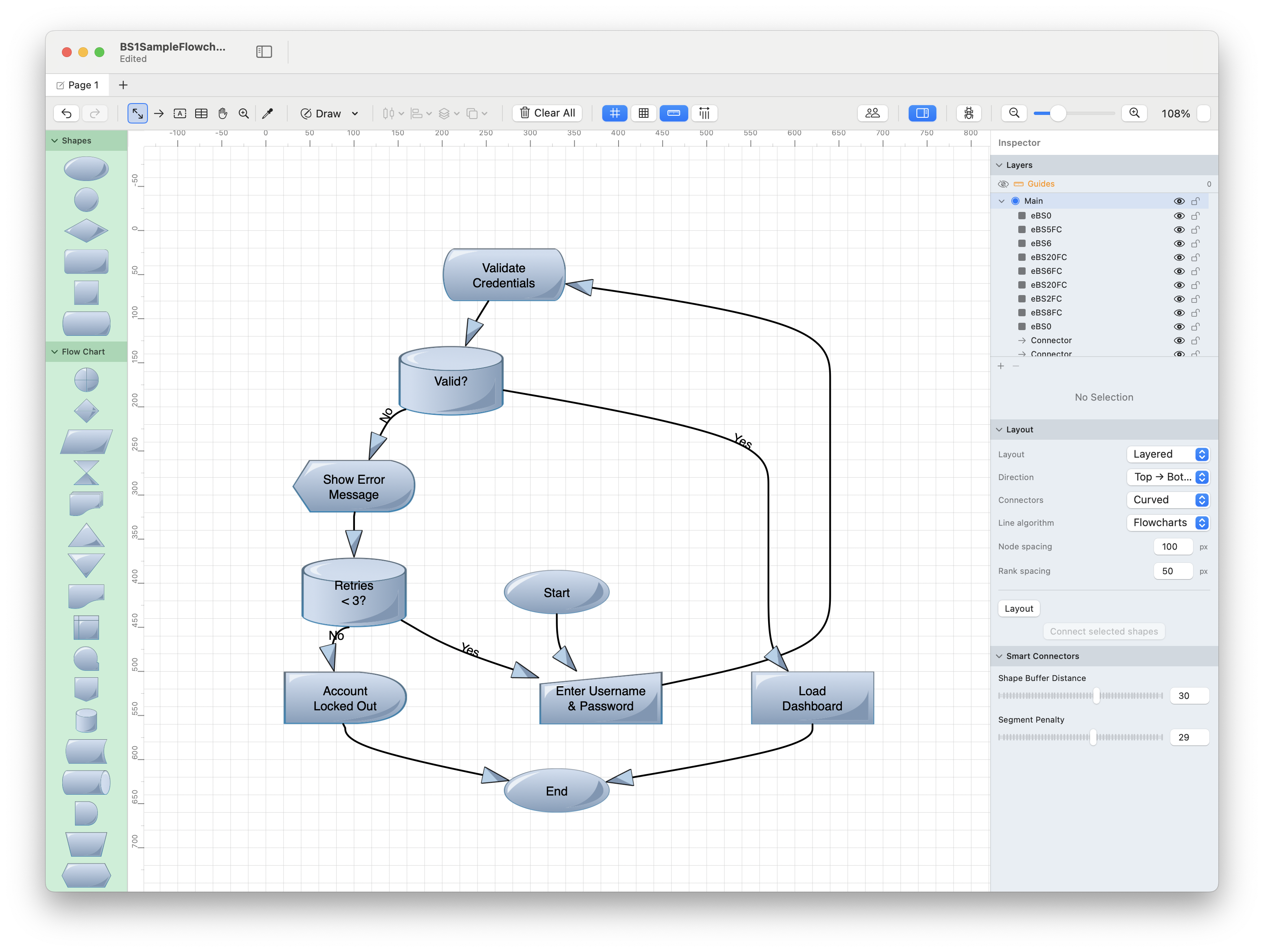
Business Style 1
Aesthetic: Clean, corporate, professional Colors: Muted blues, grays, professional palette Best for:
- Corporate presentations
- Business process diagrams
- Organizational charts
- Executive summaries
Characteristics:
- Simple geometric shapes
- Subtle gradients
- Clear, readable text
- Professional color schemes
Business Style 2
Aesthetic: Modern, sleek, minimalist Colors: Monochromatic with accent colors Best for:
- Modern business presentations
- Clean infographics
- Professional documentation
- SaaS and tech companies
Characteristics:
- Flat design elements
- Bold typography
- High contrast
- Minimalist shapes
Graphic Style
Aesthetic: Bold, colorful, modern Colors: Vibrant, high-saturation colors Best for:
- Marketing materials
- Social media graphics
- Creative presentations
- Infographics
Characteristics:
- Bright, eye-catching colors
- Modern flat design
- Strong visual hierarchy
- Attention-grabbing
Sticker Style
Aesthetic: Casual, friendly, approachable Colors: Pastel and bright colors, playful palette Best for:
- Educational materials
- Casual presentations
- Personal projects
- Creative brainstorming
Characteristics:
- Rounded, soft shapes
- Sticker-like appearance
- Drop shadows for depth
- Fun, approachable feel
Funny Style
Aesthetic: Playful, whimsical, cartoonish Colors: Bright, varied, fun colors Best for:
- Children's materials
- Playful presentations
- Creative projects
- Non-formal contexts
Characteristics:
- Exaggerated, cartoon-like shapes
- Bright, cheerful colors
- Informal, fun appearance
- High visual interest
Gradient Style
Aesthetic: Vibrant, dimensional, modern Colors: Multi-color gradients, rich blends Best for:
- Eye-catching presentations
- Digital displays
- Modern tech presentations
- App/software documentation
Characteristics:
- Linear and radial gradients
- Depth and dimension
- Contemporary design
- High visual impact
Pencil Style
Aesthetic: Hand-drawn, sketchy, informal Colors: Grayscale or light colors with sketchy outlines Best for:
- Wireframes
- Conceptual diagrams
- Brainstorming sessions
- Early-stage designs
Characteristics:
- Rough, hand-drawn appearance
- Sketchy stroke styles
- Informal, approachable
- "Work in progress" feel
Stitch Style
Aesthetic: Textile-inspired, crafted, unique Colors: Fabric-like colors with stitch patterns Best for:
- Craft and hobby presentations
- Unique, memorable diagrams
- Creative projects
- Textile industry materials
Characteristics:
- Stitch-like borders
- Fabric texture appearance
- Handmade aesthetic
- Warm, tactile feel
Sketch Style
Aesthetic: Hand-sketched, artistic, organic Colors: Varied, with rough edges and texture Best for:
- Architectural sketches
- Design concepts
- Artistic presentations
- Informal diagrams
Characteristics:
- Irregular, organic edges
- Sketch-like texture
- Artistic appearance
- Natural variation
Glass Style
Aesthetic: Transparent, modern, sleek Colors: Translucent with frosted glass effect Best for:
- Modern UI diagrams
- Tech presentations
- Overlay diagrams
- Contemporary designs
Characteristics:
- Semi-transparent fills
- Frosted glass effect
- Modern, clean appearance
- Layering-friendly
Customizable Style
In addition to the 10 pre-designed styles, Diagrammix offers a Customizable Style pack with basic shapes you can style yourself.
Best for:
- Complete design control
- Matching specific brand guidelines
- Custom visual languages
- Unique diagram aesthetics
To customize:
- Use shapes from the Customizable pack
- Apply your own fills, strokes, and effects via the Inspector
- Save a look you like as a custom style for reuse
Mixing Styles
Each document shows the palette of the template it was created with. To use a symbol from another pack, open a document that uses that pack, select the symbol, right-click it and choose Add to Clipart Repository… — it's then available from the clipart library in every document.
While each style pack is designed as a cohesive set, keep these guidelines in mind when mixing:
Recommended mixing:
- Same diagram: Use one primary style for consistency
- Different layers: Use Business for data, Sticker for annotations
- Emphasis: Use Graphic/Gradient style for key elements in a Business diagram
Avoid mixing:
- Multiple decorative styles in one diagram (Funny + Stitch + Pencil)
- Formal and informal styles without clear purpose (Business + Funny)
Choosing the Right Style
Consider these factors:
1. Audience
- Executive/Corporate: Business Style 1 or 2
- Creative/Marketing: Graphic or Gradient
- Technical: Business, Pencil (wireframes)
- Educational: Sticker or Funny
- General: Business Style 2 or Customizable
2. Purpose
- Documentation: Business, Pencil
- Presentation: Graphic, Gradient, Business
- Brainstorming: Pencil, Sketch, Sticker
- Published materials: Graphic, Business
- Prototypes: Pencil, Sketch
3. Medium
- Print: Business (safe), Graphic (if color available)
- Screen/Digital: Gradient, Graphic, Glass
- Projection: Business (high contrast), Graphic
- Web: Glass, Gradient, Graphic
4. Formality
- Very Formal: Business Style 1 or 2
- Professional but Modern: Graphic, Gradient
- Casual: Sticker, Sketch
- Informal/Fun: Funny, Pencil
Style Pack Comparison
| Style | Formality | Color | Complexity | Best Medium |
|---|---|---|---|---|
| Business 1 | High | Low | Low | Print/Screen |
| Business 2 | High | Medium | Low | Screen |
| Graphic | Medium | High | Medium | Screen/Print |
| Sticker | Low | High | Medium | Screen |
| Funny | Very Low | High | High | Screen |
| Gradient | Medium | Very High | Medium | Screen |
| Pencil | Low | Low | Low | Any |
| Stitch | Low | Medium | High | |
| Sketch | Medium | Medium | Medium | Any |
| Glass | Medium | Low | Low | Screen |
| Customizable | Variable | Variable | Variable | Any |
Creating Your Own Symbol Library
Beyond the built-in styles, you can:
- Import SVG artwork into your clipart library with View → Manage Clipart… → Import SVG... (PRO)
- Save symbols to the clipart library — right-click a selection and choose Add to Clipart Repository…
- Build custom templates of SVG shapes and arrowheads with View → Manage Custom Templates…
- Save reusable elements with fill-in text slots — right-click a selection and choose Save as Reusable Element...
See Clipart Library, Custom Templates, and Reusable Elements for details.
Tips
- Stay consistent - Use one style per diagram for professional results
- Consider color printing costs - Gradient and Graphic styles use more ink
- Test readability - Some styles don't project well on screens
- Match your brand - Choose styles that align with your organization's visual identity
- Save time with styles - Once you choose a style, stick with it for a project
Related Topics
- Clipart Library - Saving custom symbols
- Custom Styles - Saving and reusing styling
- Color Schemes - Theme-based colors
- Shapes - Working with shapes